I am G.V. Sreekumar, a faculty member at the Industrial Design Centre at the Indian Institute of Technology Bombay, India.
I teach HHI, Typography, Publication Design and Information Graphics.
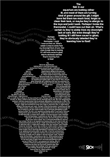
This is a platform for displaying typographical works of my students.
Renowned Typographer, Designer and Author, Mr. Jaimes Craig recently invited me to contribute the works of my students in his web site and this idea stuck me that I should provide a platform for others to have a look at student works.
My students at IDC come from various backgrounds, Fine Arts, Graphic Design, Architecture, Engineering, Fashion Design, Interior Design and so on.
Many of them hear the term "Typography" for the first time and for many of them, the "font world" starts and ends with ................grrrrrrrrrr........Arial!
As a teacher, I try my best to introduce them to the new world of letterfroms
, a world I believe is beautiful and colourful and so fascinating that one lifetime is by no means enough even to study the surface.
Slowly they begin to understand the beauty of the world beyond Arial and then they begin to enjoy it.
I make attempts to introduce them to well designed fonts (many of them my favourites!) like Univers, Helvetica, Meta, Franklin Gothic, Griffith Gothic, Rotis, Eurostyle, Trajan, Stone Sans and Serif, Berkeley, Berling, Palatino, Optima and so on...
They work with many beautiful fonts in their life in IDC that when they pass out from here and practice design, they dont get stuck with only Arial and Verdana.
The course teaches them the importance of going deep into the content, understanding the meaning in the real sense, getting into the context, create and understand the whole picture and then go through the design process.
Students learn the importance of type and their impact on the overall design solution.
The assignments are designed to take the students from one simple task, slowly moving on to more and more complex issues.
I start with one letterform, then moving on to a word, a sentence, a paragraph, a page, a poster, a book and so on...
I get around 3 modules of 4 days each in one semester.
Most of the work gets done at the end of each module, so that the students are not burdened with too much of home work (and too many pending assignments!).
Computers are not allowed in many assignments where I feel it is important for a student to use his hands and get a feel of relationships between type and space.
At the beginning, many students feel very frustrated not to work on a computer, but slowly they realise the joy of handling type.
At the beginning, the students are taken to our letterpress studio to get accustomed to the letterpress environment and basic fundamentals of typesetting.
This helps a lot in basic understanding of letterspace, wordspace, allignments etc.
I will try to document as much as possible, the works done by my students not only at IDC but at other institutes also where I am invited as visiting faculty.
This blog, I hope, will do the following:
1. Help students and faculty from different institutions to see each others' work.
2. Encourage student-student-interaction (SSI).
3. Encourage faculty-faculty interaction (FFI)
4. Help those who want to evaluate me as a teacher-either by giving them bullets to shoot me or by giving them an idea about the quality of works done by my students.
So much for "CORE INPUTS"!


